No products
Categories
Testimonials
-
Phoebe (for EcoGrid)
Simon was so helpful & responsive from the start & had our...
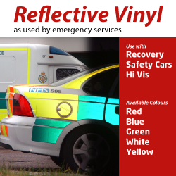
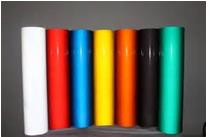
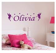
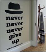
Silent Selling Power with Eye Appealing Colour on Vinyl Lettering & Signs
Colour is one of the most primordial forces of attraction. When it comes to non-verbal communication colour can convey an impression, establish a mood or send some kind of message almost instantaneously!
Making conscious use of colour on your signs or lettering can mean the difference between getting noticed and being ignored! It can render something irresistible for forgettable.
Yes, of course there is gravity but of the sensory attractions, sight is almost as unconscious. You often do not even recognize when it is affecting you either positively or negatively. You can be attracted or repulsed enough for you to respond with some kind of behaviour and without realizing it, ‘bang’ you have reacted! Your reaction can occur on many different levels at the same time. It can be mental: ‘Oh! I really like that!’, ot ‘ugh, don’t want that’.
Your reaction to colour can be strong enough emotionally to cause you to physically respond; maybe with the emotional reaction of a desire to ‘have that!’ and then you purchase something. Some of us respond this way to seeing a sign showing a great portion of some food we love, or a photo of a gadget we have been thinking about.
Marketers, designers and branding specialists depend upon these unconscious human reactions to give their work an edge; to help establish their products, logos, packaging and signs with some kind of more lasting impression. You can do something similar by more carefully considering the colours you use on your VINYL LETTERING and VINYL PRINTED SIGNS.
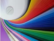
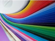
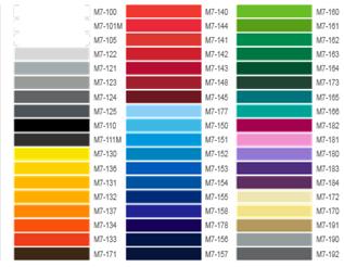
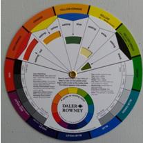 It is often quite difficult to select colours without a guide. A COLOUR WHEEL can help you make a more informed decision about the colour of vinyl you choose.
You may, for example, want a vinyl that is ‘blue’. When Tribal Signs asks you, ‘what colour blue would you like?’ the best answer may not be your own personal favourite colour of blue. Consider what shade or type of blue will relate not only to the purpose of your vinyl sign or vinyl lettering but to the action you want people who will respond to the sign might be most inclined to think, feel or take in action terms.
See: http://upload.wikimedia.org/wikipedia/commons/d/dc/Eight-colour-wheel-2D.png
The primary differences between colours can be classified as either WARM or COOL. Colours on a colour wheel are arranged in this type of order and might be described in the following way:
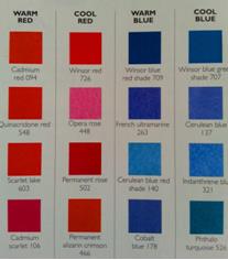 WARM:
WARM:
Red, Orange, Yellow.
COOL:
Green, Blue, Purple.
Some colour wheels show a primary ring, secondary ring and tertiary ring with differing ‘VALUES’ going from a stronger value to a lighter value. This can enable you to see more clearly the darker SHADES against the MIDTONES and lighter TINTS of each colour on the wheel.
Generally speaking some items, services or actions are traditionally or currently associated with a certain shade, midtone or tint. Consciously or unconsciously the following colour associations are generally accepted in most Western Cultures.
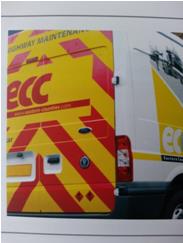
RED is associated with ACTION & IMMEDIACY!
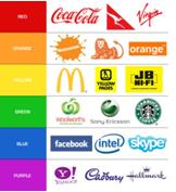
Many cultures know the associations between a strong Red and Yellow with ‘fast food; for example, Burger King, KFC and McDonald’s fast food products. Many people who go to McDonalds want a quick bite instead of having to spend the time to create a whole meal at home. Red is used with almost any situation where immediacy and action are relevant. So STOP and consider where red could be most useful to you!
 ORANGE implies an URGENCY or MOTIVATION.
There is a sense of energy with orange that does not have the same urgency as red. It has a bit more of a spirit than the physicality of red. Costa’s Coffee uses a midtone range of red-oranges to encourage the motivation to take action or to take a coffee break. When combined with other colours, two shades can create a multitude of layers of meaning. Colours can compete to create a dynamism or add additional ‘tones’ just as orange and yellow can accentuate the primary meaning of a ‘main’ colour.
(See: http://www.brandwatch.com/wp-content/uploads/2014/07/LogoColours.jpg)
YELLOW is part of the warm colour set and is ASSERTIVE.
Costa’s Coffee also uses Yellowish tints and midtones to simulate a reminder of that nice colour of ‘white coffee’ . It can serve as a gentle reminder to ‘GET’ a cuppa coffee while supporting the ‘idea’ and emotional sense of ‘comfort’ that many get from having a nice hot cup of coffee.
 A whole range of red, orange and yellow colours can generally be associated with fire, warmth and spontaneity, activity, virility, vibrancy, boldness, ambition, motivation, physical power and intention. (See:http://thriveadvertising.files.wordpress.com/2012/04/yellow.jpg)
Freedom, independence and even sexuality (boldly) can be associated with the warmth of these colours and shades. The addition of the warm shades, midtones and tints adds feeling and emotion in varying amounts encouraging the viewer to become engaged and involved in an instinctive expression of some kind of more passionate or warm feeling.
(See: http://www.brandwatch.com/wp-content/uploads/2014/07/LogoColours.jpg)
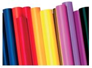
Many vinyl colours in the warm range really show off the vibrancy of vinyl signs & lettering.
Now consider the COOL range of colours, shades, midtones and tints.
GREEN is a colour of BALANCE or restoration.
It is associated with nature; plants, sprouts and a kind of ‘natural good health’ and a kind of conservative balance. GREEN has an association with support, improvement, growth, gentle expansion, prosperity (green money bills or notes) and safety (green light= ‘go’). Acer, Jaguar, Land Rover, Starbucks, Subway, Tic Tac and Double Mint Gum are a few of the major brands that use shades of GREEN.
BLUEis a powerful cool colour that is REASURRING and CALMING.
Blue is asubconscious connection to both the sea and the sky- expansive and steady, conservative with the ability to act rationally. Blue can be seen as ‘therapeutic’ in a helpful and professional manner- reassuring and dependable. Banks such as Halifax use it in this manner. Twitter, Facebook, LinkedIn and Skype, all big in the communications industry with worldwide influence use blue in their logos. AOL, Dell and PayPal also use blue to underpin their international marketing.
See: http://thriveadvertising.files.wordpress.com/2012/04/blue.jpg
PURPLE is DEEP, CREATIVE, ORIGINAL, MYSTICAL and REGAL.
Purple conveys a depth some other colours traditionally lack. Prosperity, wealth, opportunity, sophistication and authority all resonate with the cool reserve of purple. The more red the purple is, the more emotion it can invoke; the ‘warmer’ it becomes. The more blue the purple is, the ‘cooler’ it is.
 Strong purples are not common in the marketplace. Yahoo uses purple with it’s logo and branding; unusual in the communications industry which is somewhat dominated by bl ue. The singer ‘Prince’ revels in purple outfits and accessories to accentuate his unique brand.
Cadbury makes good use of purple with its packaging and branding. Zoopla, Lady Speed Stick and Hallmark Cards use purple for their logos. Nike and Adidas, sporting goods giants use purple in small doses targeting special products. Los Angeles Lakers use purple for their logo lettering against an orange basketball.
 When it comes time for you to make colour changes on your signs, logos, banners or decals or to order your vinyl lettering or vinyl signs, take a moment to consider what type of vinyl that colour might look best in: matt or satin. Identify the key emotion or several primary emotions that you want your customer to feel when viewing your vinyl signs or vinyl lettering. Consider what actions those emotions might cause or support.
Pantone Guide to Communicating with Colour By Leatrice Eiseman
is an excellent resource as are other online materials if you use the search engines to explore how colour affects your marketing results.
 Each colour also has it’s own associations. These can change in different cultures and the associations people make can be strongly linked to leading brand familiarity.
Contact Us