No products
Custom Lettering
Viewed products
-

Custom Lettering
Select your quantity, colour and font...
Testimonials
-
Phoebe (for EcoGrid)
Simon was so helpful & responsive from the start & had our...
 View larger

Custom Lettering
CVL
New product
Select your quantity, colour and font and add to cart.
Vinyl Lettering Designer
By buying this product you can collect up to 55 loyalty points. Your cart will total 55 loyalty points that can be converted into a voucher of £11.00.
More info
With this feature-rich vinyl lettering design tool you can create amazing signs and attractive labels for the work place, home or garden, vehicle or boat, exhibition or campaign – anywhere you want something to be noticed or pointed out. The Tribal Signs Lettering Designer truly does trump all others, just as our service towers above the competition. Modesty forbids we sing our own praises further, our customers do it for us – read their testimonials! – and please tell us what you think.
Now for some tips…
REVERSED LETTERING
Reverse cut vinyl lettering sticks to the inside of windows for reading from the outside. This is commonly used for cafe and shop signage, office glazing, business reception doors and window displays. Useful too for personalised windscreen stickers and rear window advertising. Etch effect vinyl is a good choice for windows as it is semi transparent.
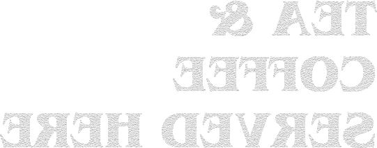
The TEA & COFFEE sign is reverse cut Etch Glass Effect vinyl in Stolleax Bold font for a window application.
STENCIL LETTERING
Instead of supplying letters we can throw them away and supply what’s left! This gives a stencil effect with lots of visible vinyl. 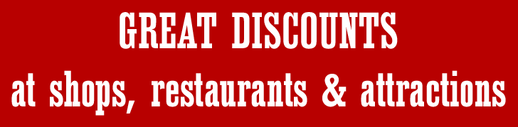 The DISCOUNTS sign is an opaque high visibility stencil that makes an impact, in Cario Medium Condensed font, Deep Red. Stencils usually need an amount of padding surrounding the lettering – that is done using the Padding controls.
 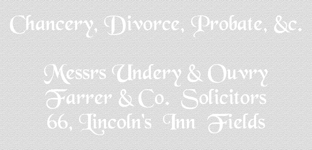 You can set each side padding separately or centre the message with equal padding all around. Note though that descenders and ascenders may distort the desired appearance, e.g. the Discounts sign is centred but clearly needs less padding at the bottom.
Translucent stencils are good for glass screens, also windows using Reverse lettering. The Solicitors stencil of Dickensian tenor is typical of what you might see in upper floor office windows. They advertise nicely, obscure the business, and let the light in. Crystal Etch; Black Chancery font.
ORIENTATION
To beat the plethora of horizontal signage, lettering on an arc can be more noticeable. Alternatively go vertical. Here are examples of both.
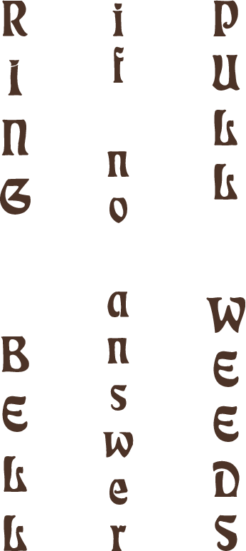
The Angle value determines the arc of the baseline that the lettering follows. An angle of zero is perfectly horizontal and 360° lays out the letters in a circle. The circumference is greatest for the top line of text and decreases towards the centre, therefore you can lay out more text on the longer arc.
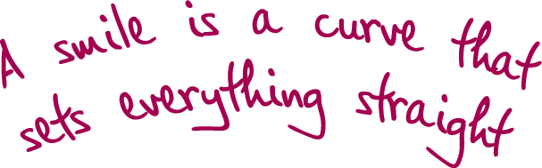
The smile is a curve curved sign forms an angle of 45°, in Jamari font and Gloss Magenta. The RING BELL vertical sign is Egema font, gloss brown.
SYMBOLS and SYMBOL FONTS
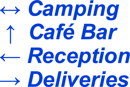
Sometimes you need more than the letters, digits and punctuation on the keyboard. We make all font characters available in the Glyph Set picker – just click the glyph you need to insert it into the text. The campsite wayfinding sign shows direction arrows and the é character entered via the Glyph Set, although you can also enter Unicode input if you know how to. The wayfinder is in Arial Bold Italic to give a clear sense of movement, and High Performance Mid Blue for outdoor longevity.
At the bottom of the font chooser are some symbol fonts which only contain clipart-like symbols. Wingdings fonts are good for circled characters, bullets and arrows. ![]() The Tribal Signs phone number sign uses Wingdings 2 in Black.
The Tribal Signs phone number sign uses Wingdings 2 in Black.
Note that the text box may not show symbols correctly if the user interface font map (Arial) differs from the chosen font.
ALIGNMENT and SPACING
The space between letters and lines (known as tracking and leading) is controlled by the spacing tools.
Justification works by distributing excess space between the characters and words according to the Justify Ratio. So a ratio of 4 means spaces get 4 times more padding than non-space characters, thus words stretch apart more than letters. To distribute all the excess space between the words only, specify a ratio of zero.
Script fonts are usually designed to join up elegantly, so you would not normally add space between the letters. To fully justify lines of text in a script font use a zero Ratio to space the letters correctly.
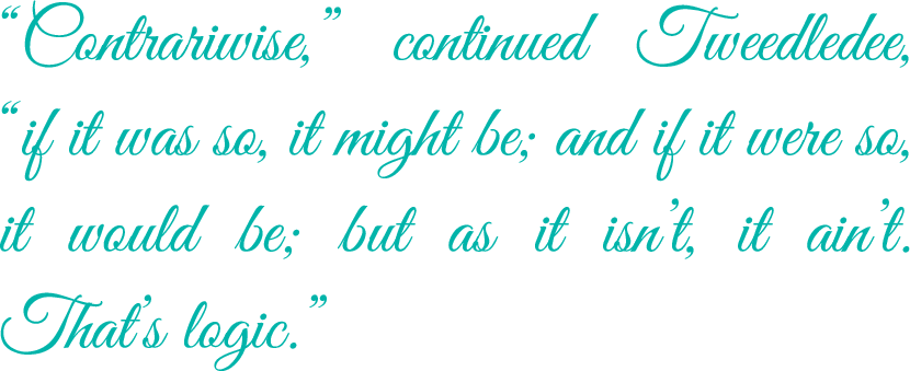
The wall quote from Through the Looking-Glass shows this in action: fully justified with normal letter spacing. It makes fine wall decor for the classroom which doubles as a teaching aid – a lesson in punctuation usage: how to use the semicolon; where to place the comma and full stop in quoted speech. It looks nice too in a child’s bedroom to add a touch of nonsensical sophistication! That sign shows justified text with 150% line height, in Great Vibes script font and Matt Turquoise (you might not like shiny letters on the wall). We produce all manner of curious wall letter decals for clubs, churches, schools and the home.
Alignment and justification works for curved and vertical text too: the RING BELL sign is justified with 150% column gap; the smile sign is justified to the slice bounds.
KERNING
Kerning draws character shapes that appear too far apart closer together. Adjacent letters, as in the word WAVE, do not normally overlap: character advance metrics ensure they do not. However kerning makes them overlap, enhancing the perceptual readability and pleasing the eye. It’s a human thing.
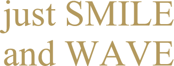
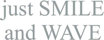
The SMILE and WAVE signs show kerning in action for font Times New Roman: the Gold lettering is not kerned; the Silver is, and the difference is quite marked. Most normal serif and sans-serif fonts benefit from kerning.
Many of the illustrations here have the Kern option enabled, but not the script fonts or curved lettering. The Looking-Glass quote actually looked worse with kerning and increased the width! Script fonts are designed to flow with a flourish without adjustment. In general, enable kerning for most horizontal jobs but test cursive fonts and curved text carefully.
The optical kerning algorithm used is complex and was developed especially for Tribal Signs. In effect, it attempts to normalise the area between adjacent characters by tracing the contours and eliminating statistical and optical outliers, then the average gap distances are used to compute an overall statistical average, and characters are shifted horizontally to normalise that value. By ‘average’ we mean a value having minimal Median Absolute Deviation, although Standard Deviation is used instead in some situations.
UNDERLINING
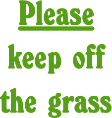
The keep off the grass notice underlines the word ‘Please’ to be polite. It is a neat sign in Grass Green vinyl and Ainefel Demi Bold font with extra line height. It would not look out of place in a park or garden. 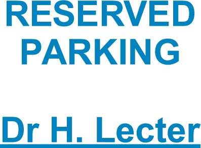 It is an example of First Line Underlining. It uses the Rounded Underline option to be more in keeping with the font.
The RESERVED PARKING sign underlines a named driver. It is an example of Last line Underlining. The font is Arial Bold in Ocean Blue.
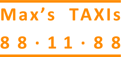
Max’s TAXIs car letter decal shows both overlining and underlining of the whole text block. Here, the lines extend across the whole width regardless of word length. The font is Calibri Bold in Reflective Yellow, for application across two car doors (the front door edge passes through the centre). This sign has increased Letter Spacing and Line Height, and a high Justify Ratio spreads the words further apart. We also produce high quality reflective magnetic vehicle livery, essential for advertising and branding on cars, vans and trucks.
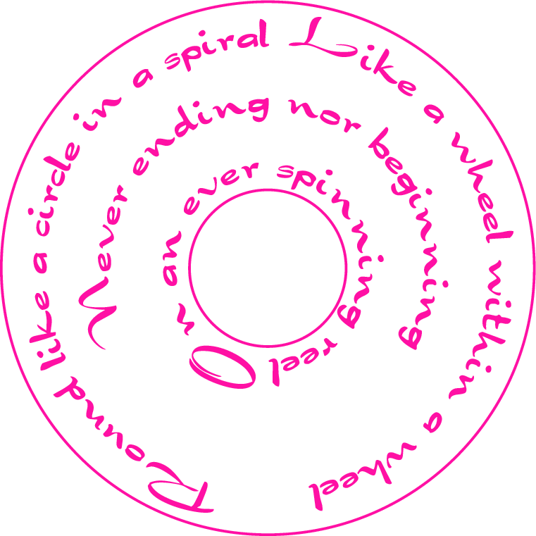
Curved text sports curved underlining as you would expect. The Windmills of your mind quote is also overlined and underlined but with a 360° Angle it forms a wheel. Darcan font, centred text, Flourescent Pink.
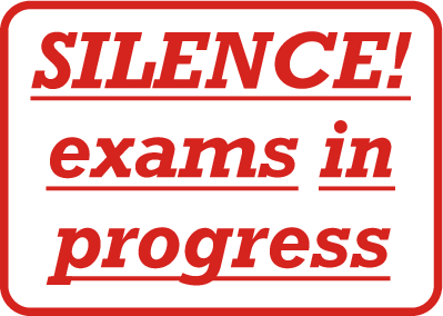
The SILENCE! message board below shows how Word Underlining, like detached enunciation in speech, can get the message across quite assertively.
Underlining is usually a last resort – consider capitalisation, italics and bold text as well.
BORDERS
You can enclose the whole lettering job in a square-cornered or rounded-corner border. By default, the border thickness is the same as the underline thickness specified by the font. The default padding between text and border is the baseline to underline distance, also specified by the font, plus any extra line height. So a line height of 130% adds 0.3 em to the border padding. The thickness and the position of borders and underlines can be tweaked slightly to enhance their effect.
Borders look good on boards. We sell customisable 5mm plastic sign boards in A3 or A4 size. You can use the Lettering Designer to customise a sign that we can mount for you on such a board. That way, you can customise it to your exact requirements rather than have us lay it out for you. All the font, alignment, colour etc. options above are at your disposal. A3 size is 420mm by 297mm. A4 size is 297mm by 210mm. Orientation may be landscape or portrait.
The SILENCE! sign, in Flame Red and Rockwell font, was designed for an A3 board for use outside examination rooms. The size is fixed precisely by setting the Overall Width and adjusting the Line Height. That sign also illustrates the Word Underlining and Rounded Border features.
The Grass and Parking notices above are typical applications for weatherproof sign boards.
Accessories
Product customization
* required fields